DESIGN & VISUAL
RODAN + FIELDS | Hydra Mask Gel Cream
How Science and Beauty Sleep Can Share a Visual Theme.
Beauty sleep means you are home and casual, but that doesn't mean the science stops. For this product launch and 360 campaign I strategized with the Creative Director, oversaw all of the copy, contributed to the photoshoot, edited the launch video, and oversaw post production for external animators.
Here is what we dreamed up.
Launch Video
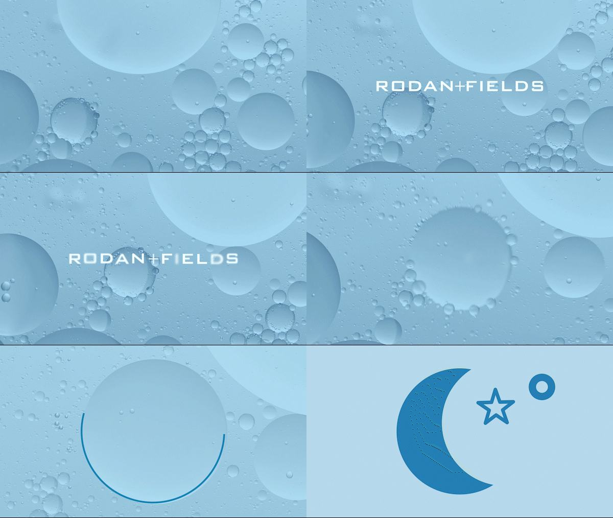
Visualizing Your Skincare
Skincare solves problems, but how do you visually represent both the problem and the solution, especially when your brand is rooted in science?
Rodan + Fields, created by dermatologists, takes a scientific approach to skincare. With the launch of a new overnight mask packed with powerful benefits, it was essential that the visual language and design of this campaign clearly and memorably conveyed both the problem and the solution in a simple, impactful way.

The Problem: Transepidermal Water Loss
Water passively leaves your skin at night when you sleep, so I was tasked with making that clear and visual. "There's your problem!"
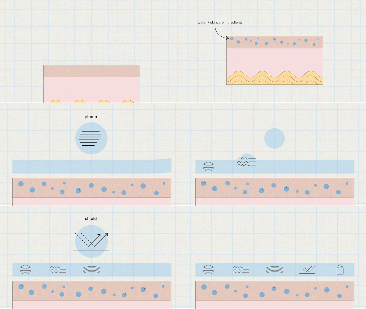
The Solution:
An overnight mask.
The solution became a before and after animation representing how Hydra Mask Gel Cream moisturizes, protects against water loss, locks in all of your skincare regimen benefits.
Abstracting Hydration, Bounce + Elasticity
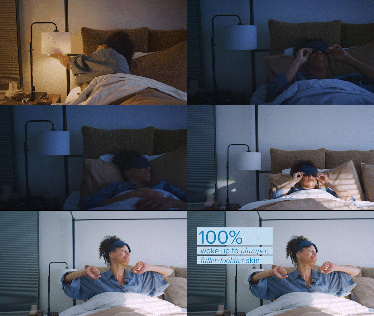
The results were in, and 100% of participants woke up with plumper, fuller-looking skin. While clinical before and after photos do speak for themselves, for this campaign these are a few ways that I helped make moisturized skin even more visual.
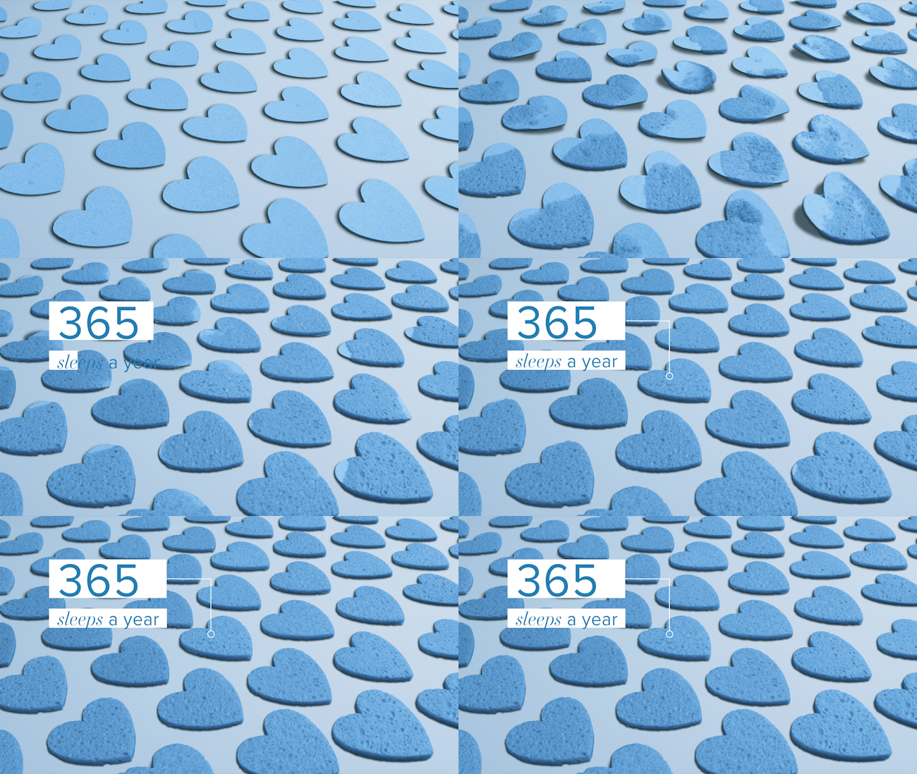
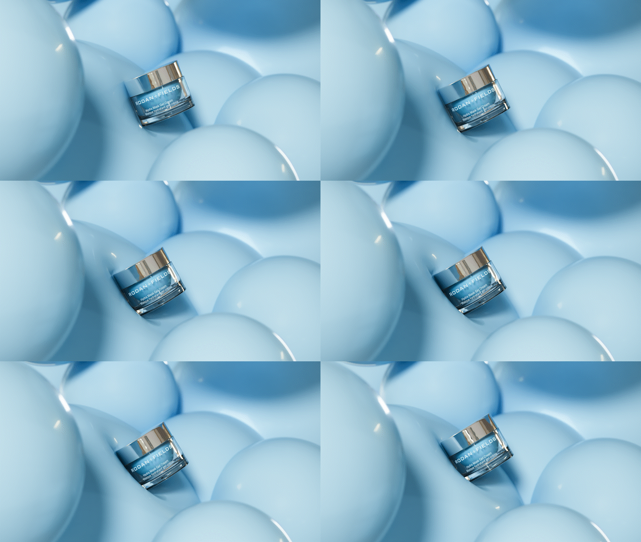
"Science, but make it cozy."
This is a mask so good, you can - and should - sleep in it. My task as Associate Creative Director was to visualize the calming, self-care portion of your nighttime routine. This had to feel powerful yet luxurious so that you could confidently (and comfortably) let that skincare science give you that glowing skin.

SINCH | Brand Photography Campaign
Visualizing a Global Super Network

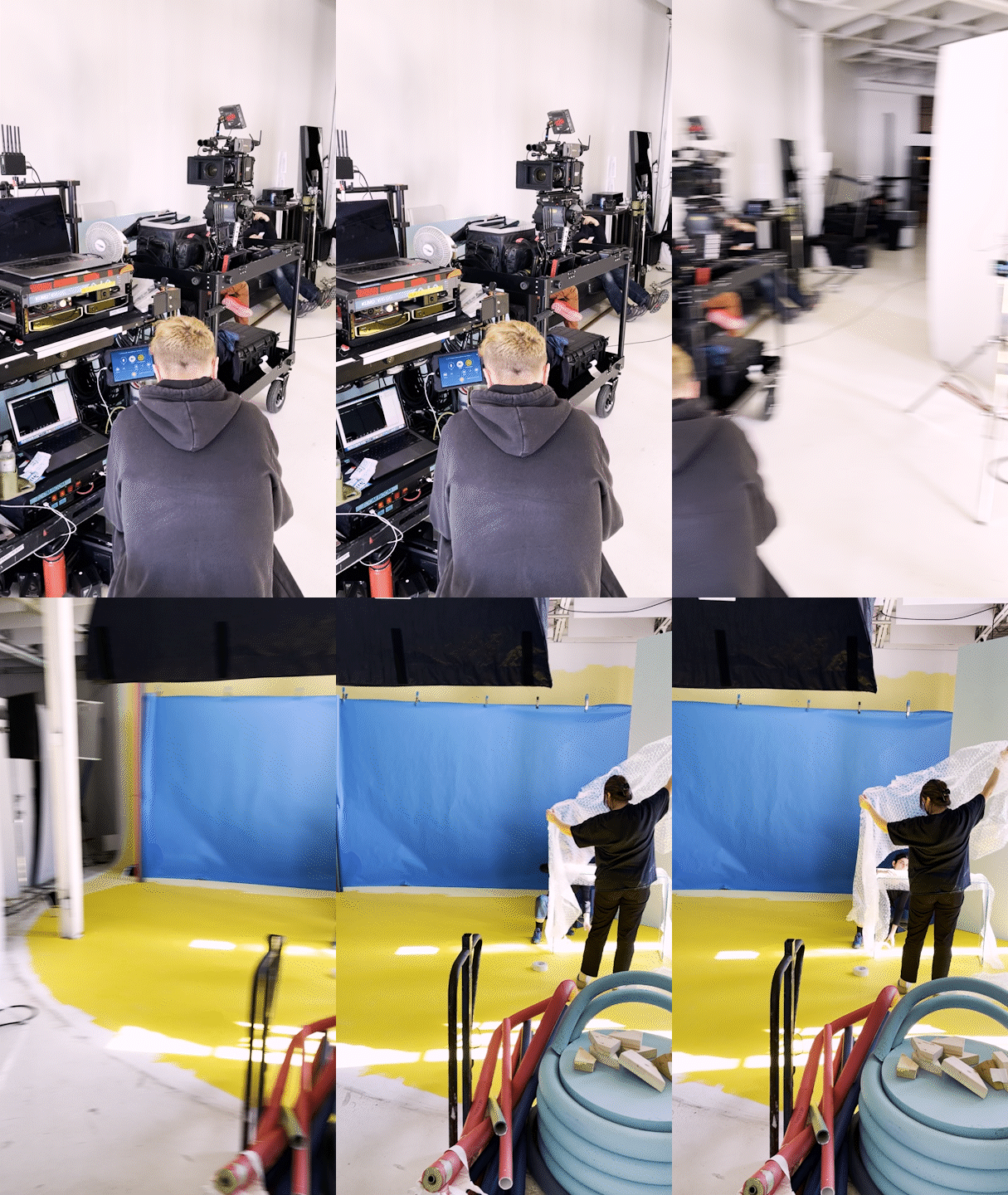
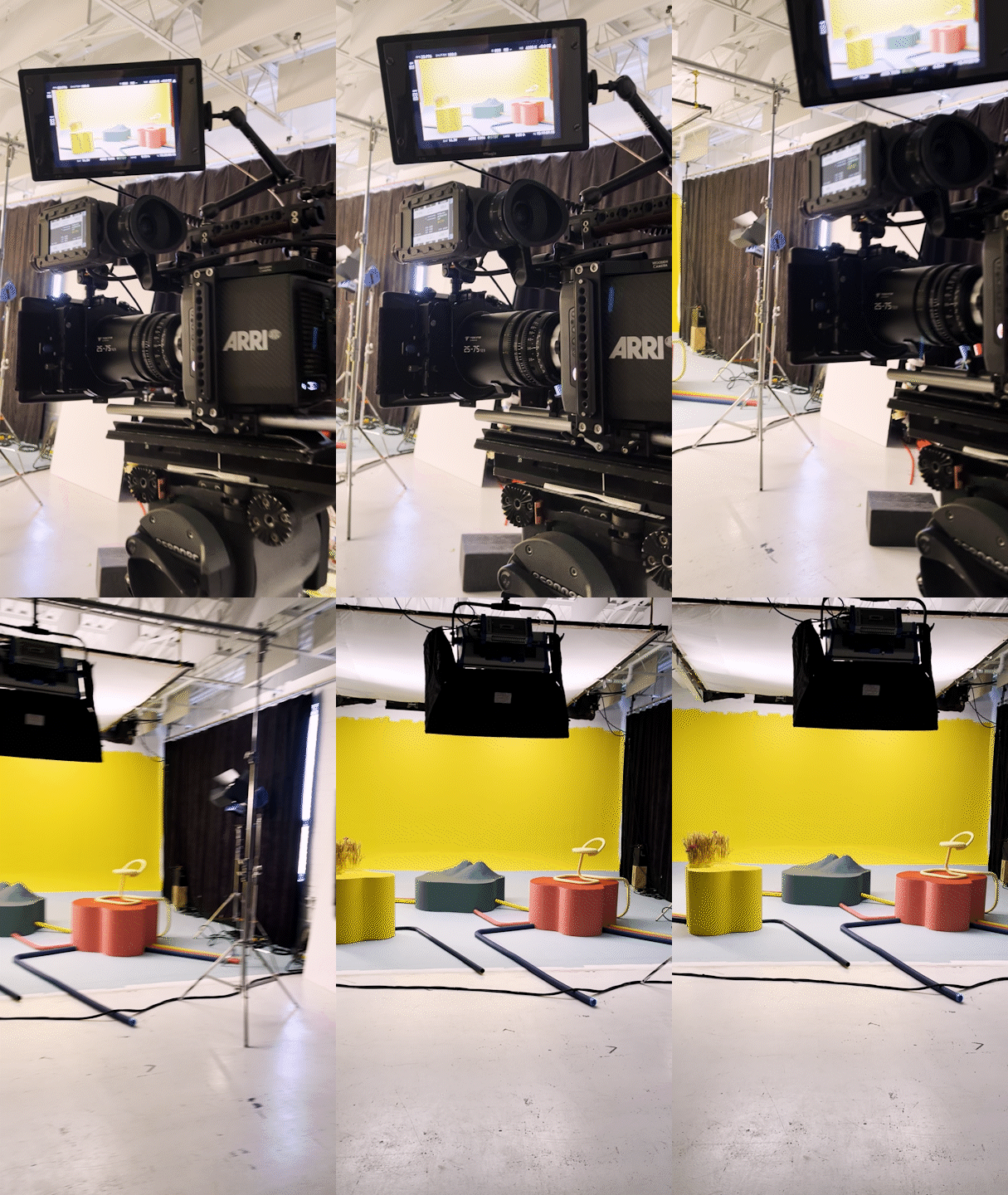
As Associate Creative Director as well as the on-set Director for this campaign, I tapped into my visual effects and compositing expertise to boldly visualize the vast communication network Sinch offers to it's customers.
Drawing heavily from Sinch's brand colors and the recurring "tubes" motif throughout, we combined forces with LM CHABOT to bring this campaign to life.


Brand Motifs and Colors Come to Life


Style Inspiration


Montréal,
Québec,
CANADA
Our Vision, in the Wild.


